Marco Fuhrer
I connected with Natalia Martinez from Switzerland through her YouTube channel. After seeing my Embrace figma website, she reached out for fresh design ideas for one of her client’s website layout. The goal was to modernize the look and make the text more readable while giving the site a more engaging and updated feel for Marco, an IT Talent Recruiter.
Space, Color and Hierarchy For Clarity
Problem
The site originally had bulky text, small pictures, and unclear navigation. It lacked a specific color palette and felt outdated. The left-side menu made navigation tricky, and there was little visual hierarchy to guide users.
Role
I worked as a copywriter, designer, photo editor, and image director. I sourced icons and other graphic elements to enhance the design and make the content clearer.
Approach
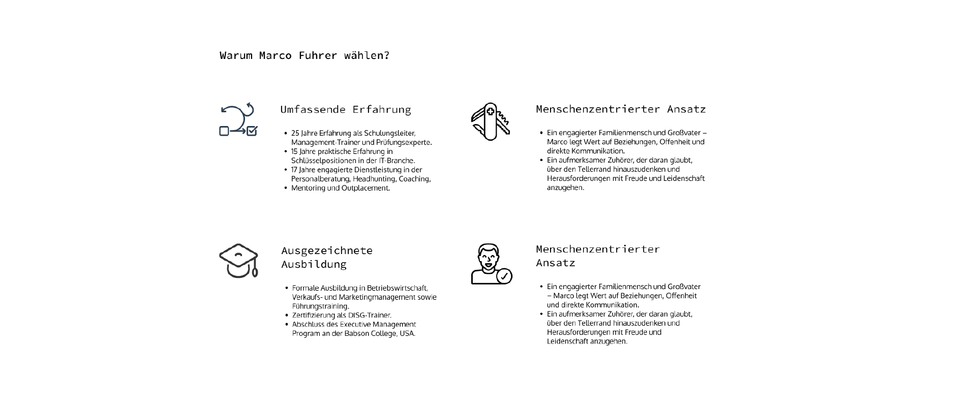
Using Adobe Photoshop and Figma, I redesigned the layout with clearer text presentation, larger images, and a more cohesive color palette. I researched and selected icons to highlight key messages.

Solution
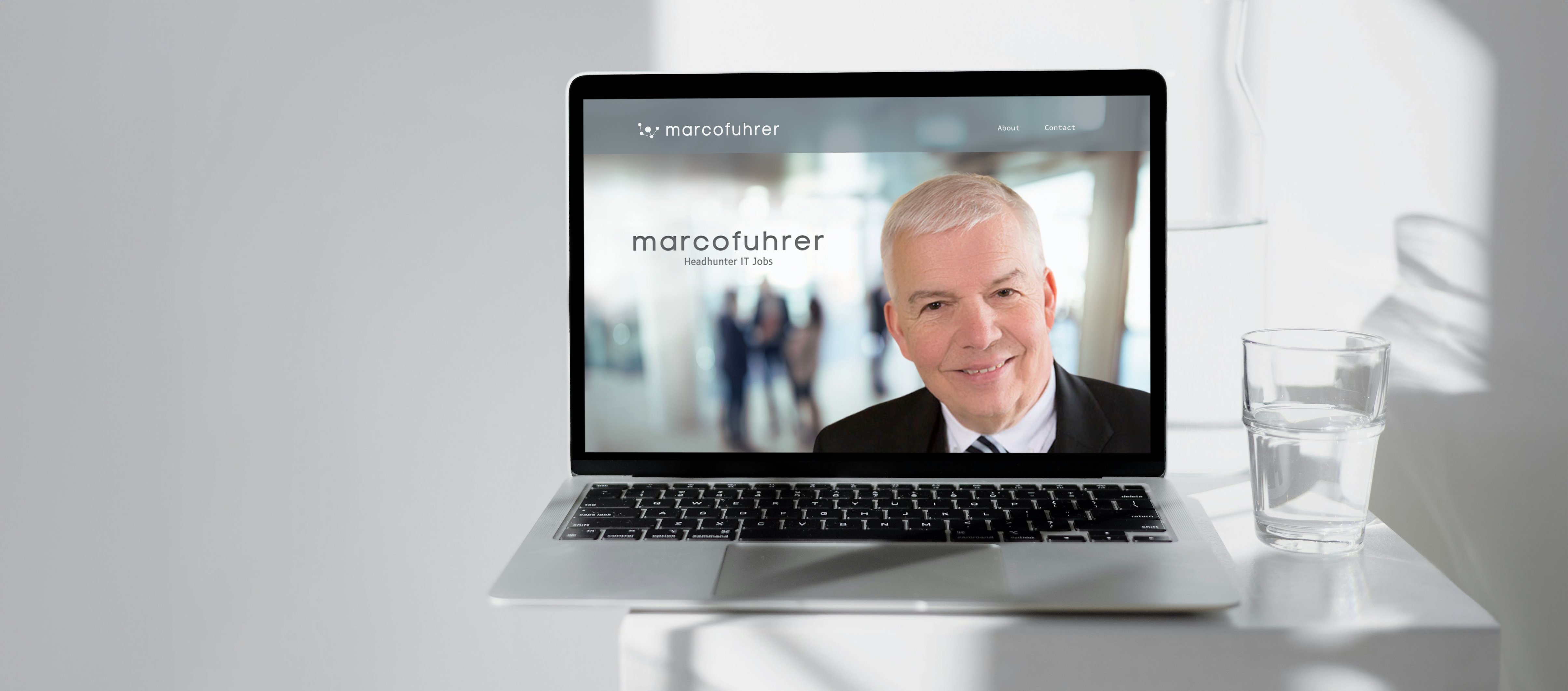
The website was modernized with a cleaner, more open layout. Larger, enhanced images were used to create visual interest while keeping a natural look. We added more color and whitespace to make the content more engaging and easier to navigate.

Outcome & Results
Natalia, the developer, decided which features to keep and implemented the updated design based on practicality and client feedback.
Challenges & Lessons Learned
Collaborating remotely from Vietnam with a developer in Switzerland was seamless overall, though budget and time constraints limited the number of revisions we could make. One key challenge was ensuring clear communication about the importance of branding and design choices, but it was gratifying to see these ideas well-received and integrated into the final product. I could also gain a bit of perspective of the reasons why a few things were not 100% implemented.