Embrace
Overview
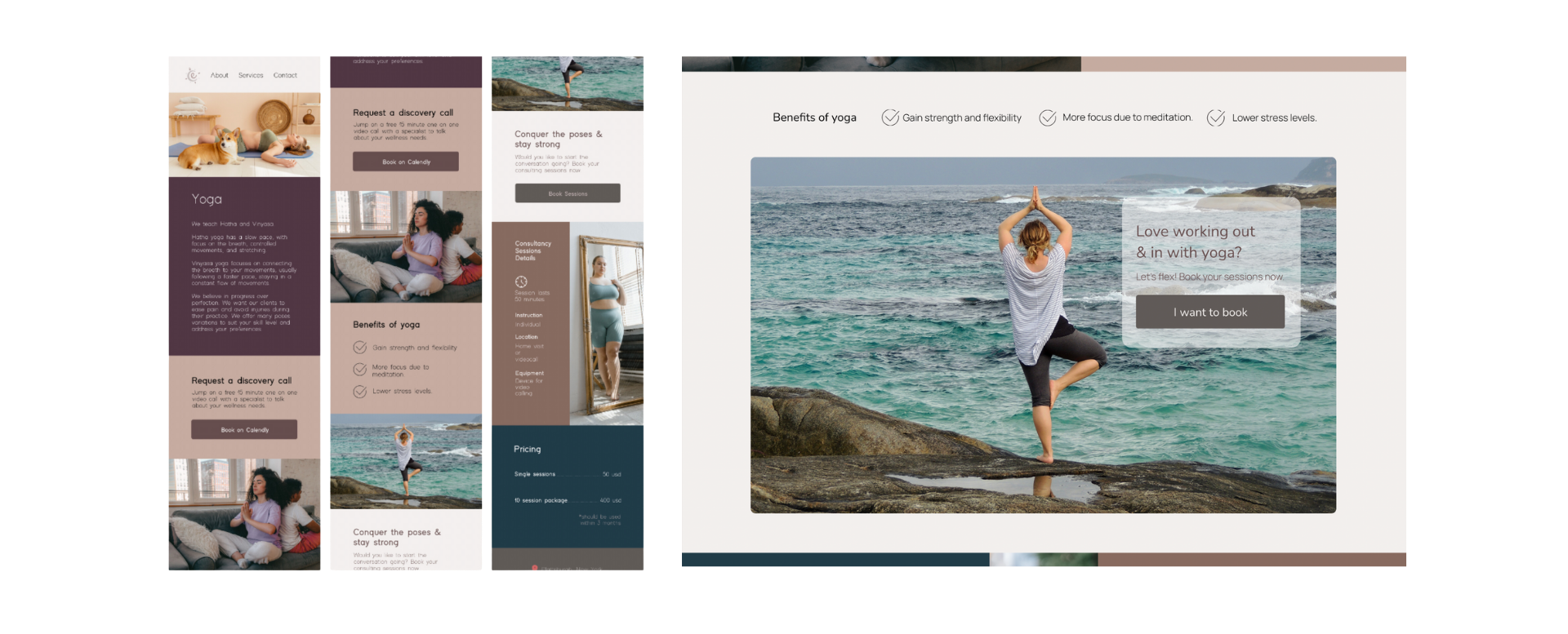
Embrace is a wellness brand founded by Mary Kay Sisson, focusing on yoga, cognitive training, and aquatics. The goal of the project was to clarify the brand identity, develop a cohesive visual presence, and create a functional website paired with an Instagram launch guidance that reflects Embrace’s holistic mission.


Designing Mary Kay’s Online Presence
Problem
Mary Kay needed to define her services clearly and establish a strong online presence that attracted her target audience. The challenge was to build a brand that resonated with her values and also created a seamless user experience across platforms.
Role
As the lead designer and developer, I handled everything from research and wireframes to final design, visual identity, web and digital strategy. I also helped coach Mary through refining her service offerings and photography and image tips.
Solution
- User Personas & Research
I began by developing user personas and researching competitors to understand the wellness market. - Design
We focused on creating a calming, modern aesthetic, using Figma for design and Adobe Creative Suite for visual assets. - Collaboration
I conducted a two workshops with Mary first one to align on her vision, brand values, and another to define copy and visuals direction.

Solution
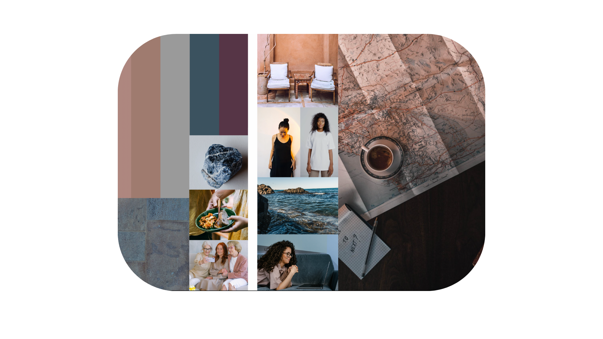
I created a cohesive visual identity centered around a my client’s chosen symbol which was a compass which represented guidance and purpose. The brand’s color palette was designed to evoke a sense of calm and wellness. The website and Instagram strategy emphasized clarity and accessibility, making it easy for users to explore services and connect with Embrace. We also set up an easy-to-manage pricing structure for her services.


Outcome & Results
The project delivered a unified visual identity, a functional website, and guidance for creating content on instagram, allowing Mary to communicate her offers and own story with clients more effectively. Mary has received positive feedback on her website and business cards.

Challenges & Lessons Learned
Mary Kay wanted many visual elements and embellishments in her logo, which made the design feel cluttered. We found a middle ground where I included more than I usually would, but she was happy with the result. Since she sometimes struggled to focus, I began creating drafts as if I were her, allowing her to make small tweaks. This kept the project moving forward.
I also revamped my process. Now, I start with an intake form, followed by a call, client homework, and a workshop. This keeps everyone involved and provides options instead of a blank slate. It’s especially helpful for those who aren’t familiar with design or may have learning difficulties.
Balancing Mary’s desire for a visually rich design with a focused strategy was a challenge. This project taught me how important it is to guide clients through collaboration while sticking to good design practices. I’ve streamlined my approach, making it more effective and inclusive.
I’ve also included key emails with buttons to access materials and Komodo video walkthroughs.